![]()
![]()
![]()
Use LEFT and RIGHT arrow keys to navigate between flashcards;
Use UP and DOWN arrow keys to flip the card;
H to show hint;
A reads text to speech;
267 Cards in this Set
- Front
- Back
|
Futurists |
Italy, Early 1900s Beliefs: change is good, looking towards future (hated history and past), wanted war, factory objects over classical art, shocking art, said previous art is lies, rethought letters, sounds, spelling Art: captured movement (Picasso's Cubism) Proponents: F.T. Marinetti: wrote Les Mots en Liberte, Futurist Manifesto |
|
|
F. T. Marinetti |
Italian, 1900s (lived in Paris) - lead proponent of futurist movement - wrote Les Mots en Liberte(Liberation of Words): rethought, spelling, letters, sound, uppercase letters - helped write Futurist Manifesto (1909): hated women, declared "speed" (change will accelerate) - took part in Dada movement |
|
|
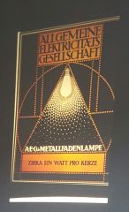
Peter Behrens (1890s) - brand identity poster for AEG - example of using a single vision to summarize a company |
|
|
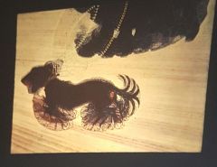
Giacomo Balla, 1912 - captures movement(futurist ideal of world is always changing) - similar to Picasso's idea of a painting doesn't have to be still: multiple angles/cubism |
|
|
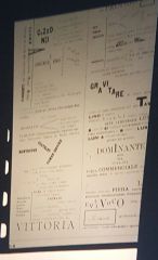
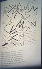
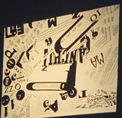
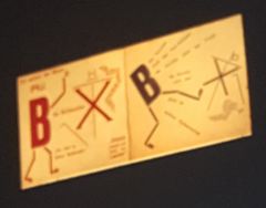
F.T. Marinetti and other Futurists (1909) - page from Futurist Manifesto: hated women, and declared "speed" |
|
|
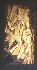
Marcel Duchamp (1904): Nude Descending Staircase - captured futurist ideals of movement/change - part of 1900s Armory Show in (NY, Chicago): collection of paintings by european cubists/futurists - lead to modernism |
|
|
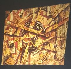
1900s (Armory Show in NY, Chicago) - collection of paintings by european cubists/futurists - hated by newspapers (not traditional art) - incorporated type into art |
|
|
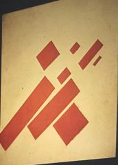
Kasmir Malevich (1904/5) Suprematism 8 Red Rectangles (Beginnings of Non-Representational Art) - traveled to paris: aware of futurists, Picasso, Duchamp - accurate art: non representational/abstract: left behind idealistic art |
|
|
1862 |
American Civil War (part of New Technology leading to WW1) - introduction of metal ships, crude submarines, guerilla warfare |
|
|
1900s Technology |
New Science/Technology 1900-40s Acceleration of Change - Albert Einstein - e=mc2, theory of relativity (Everything we know is wrong!) - Sigmund Freud (1903) - psychology - Wright Brothers (1890s) - flying - Telephone, Radio, Electricity - shocking technology/news - enforced/inspired futurist ideals of change is good |
|
|
Germany 1900-1914 |
Aspires to become imperial nation - makes army, weapons - spurs WW1 |
|
|
1914-18 |
WW1 - revolutionaries (like the futurists) fed up with gov. - cause: assassination of Franz Ferdinand: Austrian Archduke (treaty effect) - many design movements: A and C, Futurists, Dadaists - mechanized carnage - end: Germany takes full reparations - causes German economy to sink |
|
- |
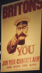
1915: Alfred Leete (Britain) World War I - first confrontation poster: join the British Army! |
|
|
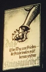
1915: Contemporary German Poster WW1 - weirdly blackletter/medieval (Arts and Craft Vibe) - northern european calligraphy - idea: give war bonds to fund the war |
|
|
1915: Soffici (Futurist) WW1 Influence - new typography style: no baselines/formal arrangement - broke rules/traditions: experimental visual typography |
|
|
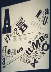
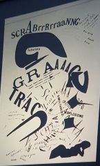
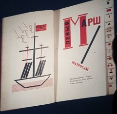
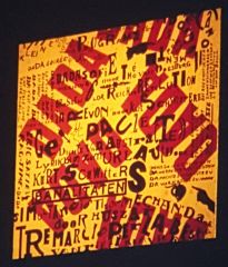
1915: F.T. Marinetti (Futurism) WW 1 Influence - page from Les Mots en Liberte: - expressed war through sounds/words: explosions, guns, yells - contradicted traditional typography |
|
|
1915: Edward Johnston (England) WWI Influence - Johnston Sans Typeface (similar to Gill Sans) - for London Underground Corp: legible typeface for subway - not futuristic though - teacher of Gill Sans |
|
|
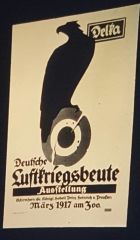
1917: German WW1 Exhibition poster - german eagle/circle: symbol of royal air force - exhibition: show down objects in war - blackletter typeface but Japan influence |
|
- |
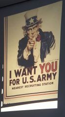
1917: Flagg (United States) WW1 Influence - copy of british poster - year US gets in war |
|
|
Dada |
1917: WW1 Influenced - Ideas: hated values of time, embraced absurdity/stupidity - tied to surrealism - Art: broke baseline, newspaper style, words on images - Proponents: Marcel Duchamp, G. Appolinaire, F. T. Marinetti's late work, Kurt Schwitters |
|
|
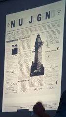
Dada Example (1917): New Youth WW1 Reaction - broke baseline, newspaper style, words on images |
|
|
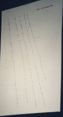
1907: G. Appolinaire (French): Ill Pleut WWI Reaction - poet, part of poet group: created pattern poetry - applied futurist ideals: to create expressive typography |
|
|
1917ish: F.T. Marinetti WW1 Reaction, Dada/Futurism - raw sound expression of WW1: woman reading letter from war - went against typographic rules |
|
|
Dada 1917ish - stock market exchange |
|
|
Russian Revolution |
October of 1917 - Octoberists take over, royal family killed - Marxist Leninist Revolution: take over factories, communism: benefitting everyone equally (context of 1850s marxist ideas of class struggles) |
|
|
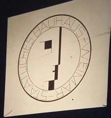
1919: 1st Bauhaus Logo - done by hand completely: expressionism, arts and crafts, symbolic - reflected early bauhaus ideas: a and c background |
|
|
1917ish: Early Bauhaus Poster - Johannes Itten - utilized grid sytem, alignment, but blackletter - confusing: mixture of modernism/medieval |
|
|
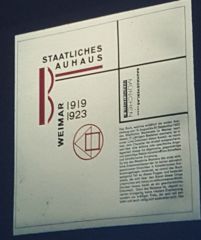
1923ish: Second Bauhaus Logo - completely different than 1st logo - example of visual science, machine made (no sign of expressionism) - man and machine: a new unity |
|
|
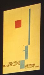
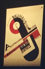
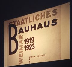
1923: Bauhaus Exhibition poster - man machine, modernism, visual science |
|
|
Bauhaus |
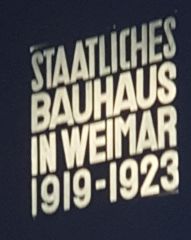
1919, Weimar Germany - response to World War I - rebuild society - influenced by : Constructivists(Russians), De Stijl, Futurists - Weimar, Germany (Building House - to rebuild after war) - founded by Walter Gropius - Figures: Johannes Itten, Kandinsky, Joseph Albers Early Bauhaus: expressionist, artistic Later Bauhaus (1923) - socialism influenced - Modernism WWI Influence: machines to kill: taming technology - “machines in the service of man” - Gropius - keep the quality, add idea of machine made, serve humanity 1923: Exhibition: graduation show - goes public - visual science - geometric shapes and primary colors - inspired by constructivists, futurists, soviet communism, technology 1925: reopened in Dessau - architecture based - seen as punks - nazis persecuted students/teachers for ideas Moves to Berlin Factory - closed in 1933: Hitler comes to power Ideas move to US - ideas spread very fast to other designers: Zwart |
|
|
Post WW1 |
Hitler in Germany: starts building arms to create jobs/improve economy
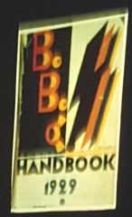
- creates highway system 1929: Great Depression |
|
|
WW2 |
(1939 - 1945)
- Dec. 7,1941: America Joins War (Pearl Harbor) - End: 1945: Hiroshima/Nagasaki Atomic Bomb - Marshall Plan: US diplomacy to give money to other countries for rebuilding |
|
|
De Stijl Movement |
1917 (Holland)
- same time as Russian Revolution - influenced by Suprematists, Constructivists, Futurists, Bauhaus - economically modern, modular, geometric, strict grid, sans serif, swiss type designers - Visual purity: clean - primary colors - art, architecture - figures: Pierre Mondrian and Theo Van Doesburg - Kuntism: 3 languages in one book |
|
|
Russians and the Bauhaus |
- Soviet graphics (Lissitzky and Rodchenko) - were printed in Germany (didn’t want white army to find out) - spreads in Germany |
|
|
1920s Technology |
- Photographs in design: half tone screen
- using black dots to create grays |
|
|
Photo Montage Experimentation |
1920s Why: completely realistic depiction (visual truth) - fueled by new half tone screen technology - Rodchenko |
|
|
Alexander Rodchenko |
Russian constructivism (Early 1900s)
- symmetrical modern design: graphic strength and stability - figures aren’t detailed and organic - extreme simple shapes - communism driven: man and machine - photo montage experimentation: integrated type, graphics, and photos |
|
|
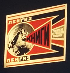
El Lissitzky |
(Constructivist 1920s)
- Russian Designer (revolutionary designer) - combined aesthic of abstract art and political message - used Malevich’s art in graphic design - did dutch magazine cover - childrens book, poetry for the voice, kunsitism book - combined modern art with russian political cartoons - driven by communist ideals (red vs white (old tsar)) |
|
|
Russian Constructivists |
1920s constructive art: avant garde influenced by Suprematism: painting style of red, black, and white color scheme: both cheap and traditional Russian textile colors (associated with normal people) - Maya Koeffsky, El Lissitzky, Alexander Rodchenko |
|
|
Maya Koeffsky |
1920s ( Russian Constructivism) - revolutionary poet - collaborated with El Lissitzky- made political cartoons |
|
|
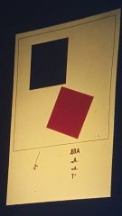
Kasmir Malevich |
(Suprematist: painting style 1900s)
- abstract art/avant garde - Russian designer - (also made red boxes): 2 Squares |
|
|
Surrealism |
- Dada + Freud
- Salvador Dali |
|
|
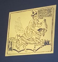
Russian Design in 1900s |
Russia: political cartoon: aristocrat
- context: Russian Tzars (brutal political oppression) - tradition of political cartoon making - couldn’t say it, had to visually make statement |
|
|
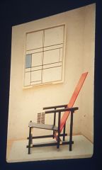
Pierre Mondrian |
Dutch (De Stijl) - dynamic visual balance - only vertical and horizontal lines: visual purity - clean is beautiful |
|
|
Theo Van Doesburg |
(Dutch) (De Stijl)
- takes Mondrian’s paintings into graphic design - guest faculty at Bauhaus (spread to Bauhaus) - ideas: revolution, socialist, art based on ideas - typography |
|
|
Russia: political cartoon: aristocrat - context: Russian Tzars (brutal political oppression) - tradition of political cartoon making - couldn’t say it, had to visually make statement |
|
|
Maya Koffsky
- political cartoon criticizing Russian aristocrats |
|
|
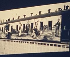
- Spreading communism through mobile advertising: attack capitalists
|
|
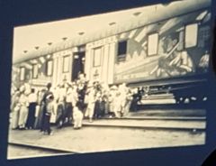
|
- advertising communism ideas on train through open lectures
- can’t be caught |
|
|
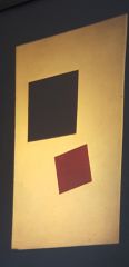
Kasmir Malevich: (also made red boxes): 2 Squares
- avant garde, abstract art, suprematism |
|
|
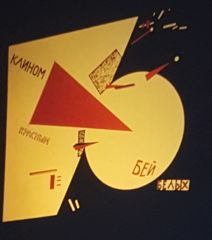
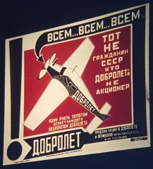
- Beat the Whites with the Red Edge: El Lissitzky
- new (red army) vs old tzar believers (white army) - combined modern art with Russian political cartoons |
|
|
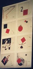
- 1922: El Lissitzky: Russian Constructivist Children’s Book - book cover using Malevich’s painting
|
|
|
- inside of children’s book: El Lissitzky
- used abstract art - communist ideas to children |
|
|
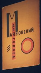
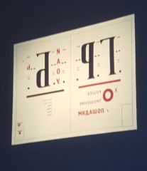
- Poetry for the Voice (book): Maya Koeffsky
- made by El Lissitzky - used to recite poems to oppressive capitalist |
|
|
El Lissitzky - page from “poetry for the voice” - new invention: had thumb index (to find page) |
|
|
El Lissitzky - page from “poetry for the voice” - example of tabs for each section - ideas from futurists |
|
|
El Lissitzky - page from book(poetry for the voice): Russian Imperial code of arms: birds heads cut off - overprinting (overlapping) |
|
|
- symmetrical design example (Rodchenko: Russian Constructivist)
- communism philosophy: figures (workers) are part of group - man and machine body types |
|
|
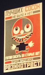
Alexander Rodchenko (Russian Constructivist) - advertisement for rubber nipple factory |
|
|
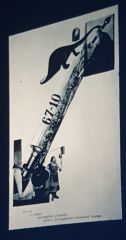
Alexander Rodchenko (Russian Constructivist) - extreme simple geometric shapes for figures- for early Russian air force (1922) - strong hierarchy |
|
|
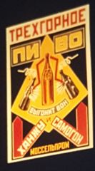
Rodchenko (Russian constructivism) beer advertisement - strong geometric shapes, symmetry, angles |
|
|
Photo Montage Experimentation Rodchenko: photo montage 1922 - new technology: half tone screen - man and machine idea in photos - visual truth |
|
|
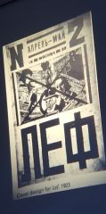
Photo Montage Experimentation - 1923: Rodchenko for Lef Magazine (communists) - photo collage |
|
|
Photo Montage - 1924: Rodchenko: cover for detective novel - integration of type, graphic, and photos |
|
|
Photo Montage - Rodchenko: 1923- picture of woman shouting “learn to read” - communists wanted people to be literate - to control what they read |
|
|
1917 De Stijl - Pierre Mondrian: example of De Stijl |
|
|
De Stijl 1923: Doesburg’s typography - ideas: revolution, socialist, art based on ideas |
|
|
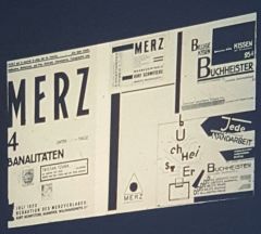
Dada 1917 Kurt Schwitters: German Artist (Bauhaus instructor) - spreads to Bauhaus - political cartoon against church - influenced by constructivist content - influenced by futurists: type experimentati |
|
|
Dada 1917 - Kurt Schwitters: poster for Dada Evening (compilation of absurd actions) - Theo van Doesburg (De Stijl) is there |
|
|
Bauhaus - inspired by El Lissitzky, Rodchenko, De Stijl - example of Classic Modernism - poster for exhibition show |
|
|
Bauhaus - catalog from exhibition show for 1923 |
|
|
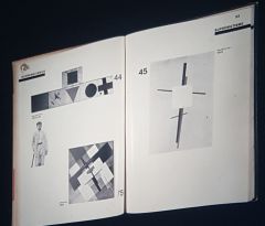
Bauhaus - Maslo Maholoy-Nagy: catalog from exhibition show for 1923 - friend of Gropius |
|
|
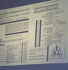
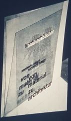
Bauhaus Exhibition - order form for Catalog: Maslo - elegant negative space - Influence: Mondrian, futurism, dada, constructivist |
|
|
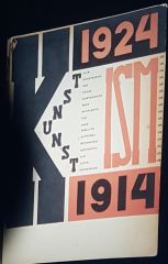
El Lissitzky (Russian Constructivist) - book to explain 1914-1924 design movements (Kunstism) |
|
|
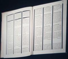
El Lissitzky (Russian Constructivist) - inside Kunstism Book - 1st book to graphically show grid system - international style example: 3 different languages |
|
|
El Lissitzky (Russian Constructivist - Kunsitism Book - spread from Lissitzky’s book: explained suprematism |
|
|
Kurt Schwitters |
Dada Movement German Artist (Bauhaus instructor) - spreads Dada to Bauhaus - expressive typography: inspired by futurists - political cartoons: inspired by constructivists - poster for dada evening |
|
|
Development of Modernism |
Early 1900s: - worked well with communism - suprematism, russian constructivism, abstraction, visual modernism, avant garde |
|
|
Suprematism |
1900s -abstract painting style - visual truth: it is what it is - Kasmir Malevich |
|
|
Maslo Nagy |
1920s: Bauhaus Designer - friend of gropius - elegant negative space, dynamic grid structure - inspired by Kuntism - designed catalog for exhibition show, bauhaus book catalog, book #8(painting, Photography, and film) - influence: mondrian, futurism, dada, constructivist - went to london - 1930s: invited to come to Chicago (along with other designers to make new design school like Bauhaus: Institute of Design - Back in Germany, there was the Hocshvle fur Gestaltung (ULM) |
|
|
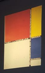
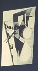
Moholy-Nagy (Bauhaus designer) - production of bauhaus books poster for exhibition - included books by Gropius, Paul Klee, Mondrian, Doesburg, - showed dynamic grid structure |
|
|
Theo Van Doesburg (Bauhaus) - Book #6 from Bauhaus Book Catalog |
|
|
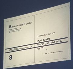
Maslo Nagy (Bauhaus) - dynamic symmetry and structure - book #8: Painting, Photography, and Film - from Bauhaus book catalog |
|
|
Maslo Nagy (Bauhaus) - inside of book #8 Painting, Photography, and Film - dynamic grid structure: inspired by Kunstism book |
|
|
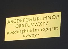
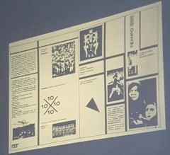
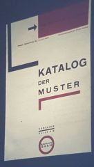
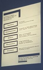
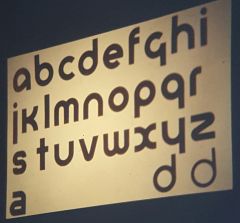
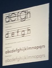
Herbert Bayer |
Bauhaus designer (1920s) - 1919: student at Bauhaus - so good, asked to become teacher after graduating - made bauhaus type: Universal Alphabet (1925) - 1st to use photo staging technique - catalog of objects grid, exhibition posters for Bauhaus |
|
|
Herbert Bayer (Bauhaus) - Katalog de Muster: catalog of objects to buy from Bauhaus |
|
|
Herbert Bayer (Bauhaus) - inside Object Catalog - list of things you could buy from Bauhaus - strong grid, structure |
|
|
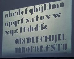
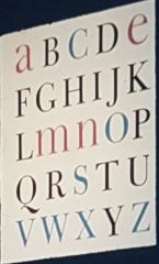
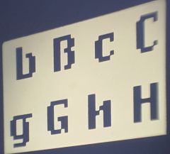
Herbert Bayer (Bauhaus) - Universal Alphabet 1925: for Bauhaus typeface - aesthetic: basic minimal forms |
|
|
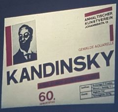
Herbert Bayer (Bauhaus) - made for Kandinsky exhibition at Bauhaus - dynamic angled structure |
|
|
Joseph Albers |
Bauhaus 1920s - color theorist: interaction of color - made modular stencil font |
|
|
Joseph Albers (Bauhaus) - modular alphabet - stencil font: broke apart type - inspired by Bayer's alphabet |
|
|
Graphics and Photography |
Bauhaus Herbert Bayer - using photography to create a new reality - staged photography |
|
|
Herbert Bayer (Bauhaus) Staged Photography - cover for bauhaus publication |
|
|
Maslo Nagy (Bauhaus) Staged Photography - Bauhaus Book: From Material to Architecture |
|
|
Bauhaus Influence |
Bauhaus's ideas of modernism spread to other designers for commercial use after the 1923 exhibition - Piet Zwart - Henrick Werkman |
|
|
Piet Zwart |
Bauhaus influence 1920s - applied modern experimental design to mainstream culture - super modern design for normal people/businesses - used modern elements as infographics to explain things - inspired by de stijl, bauhaus, futurists |
|
|
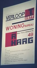
Piet Zwart (1923-4) Bauhaus Influence - for real estate agency - very de stijl/bauhaus influenced - modern design for average person - very shocking to see |
|
|
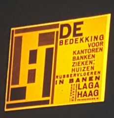
Piet Zwart (1923-4) Bauhaus Influence - 1923: ad for hardwood flooring - shockingly modern |
|
|
Piet Zwart (Bauhaus Influence) - brochure for music group - typography, structure (futurism, constr. inspired) |
|
|
Piet Zwart (Bauhaus Influence) - catalogue for Dutch Cable Factory - experimental type design: futurist inspired |
|
|
Piet Zwart (Bauhaus Influence) - from Dutch Cable Factory Catalogue - influence: futurist (change type use but more practical) |
|
|
Piet Zwart (Bauhaus Influence) - information design: circle shows magnification |
|
|
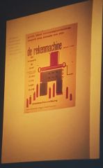
Henrick Nicholas Werkman |
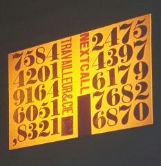
Bauhaus Influenced 1925ish - owned print shop - went to Bauhaus Exhibition: super inspired - inspired: Zwart and Mondrian too - starts art magazine: Next Call - made abstract art with unlikely print materials: wood blocks, scrap paper, tools - prints would be seen everywhere in the city |
|
|
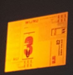
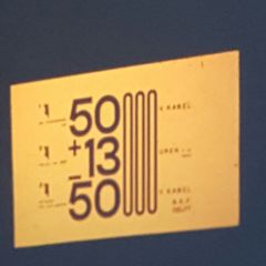
H. N. Werkman Bauhaus Influence - Numbers |
|
|
H. N. Werkman (Bauhaus Influence) - Abstract art print - made from printing wood slabs |
|
|
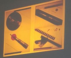
H. N. Werkman (Bauhaus Influence) - 1925: adding machine - example of print material art |
|
|
Merzism |
The new Dada after WW1 - blend of constructivist and dada - more refined |
|
|
Merzism - Merz Magazine: about Tristan Tsara (Dada proponent) - inspired by: Nagy, futurists, and Dada |
|
|
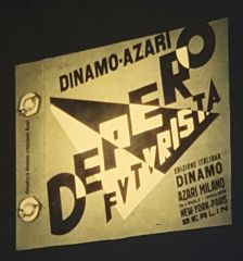
New Futurists |
Futurists post WW1 - dynamic energy - didn't want war anymore - proponents: Fortunato Depero |
|
|
New Futurism Fortunato Depero - book cover - super dynamic design |
|
|
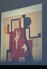
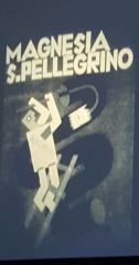
Fortunato Depero |
New Futurism (post ww1) - super dynamic designs: contrast, angles - didn't get that popular, too literal - made ads for commercial design |
|
|
New Futurism Fortunato Depero - soda company ad: magnesia man cleaning out digestive track - part of why he wasn't that popular |
|
|
Jan Tschichold |
Germany 1920s - one of the most influential graphic designers of history - why: super clever use of shapes and ideas - son of printer - great design for commercial ads - bauhaus influence: attended exhibition, changed style completely - created New Typography (book): explained modern design to the average printer/person - goes to switzerland |
|
|
Jan Tschichold 1920s - series of posters for cinema - cleverly showed inside of theater |
|
|
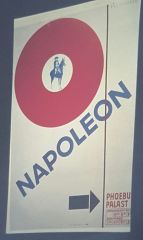
Jan Tschichold 1920s - movie poster for Napoleon - inspired by lissitzky |
|
|
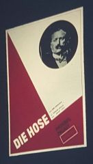
Jan Tschichold 1920s - poster for "the socks" |
|
|
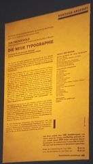
Jan Tschichold 1920s - Die Neue Typographie - how to guide: modern layout/design |
|
|
Pictorial Modernism |
- 1920s - Non-abstract Modernism - using simple shapes that are representational - can be inventive: not exact photography - more ideal for commercial use |
|
|
Paul Colin (pictorial modernism) - french - Jazz poster: of josephine baker, armstrong - using simple shapes |
|
|
Fernand Leger (Pictorial Modernism) - representative objects, simple shapes |
|
|
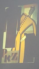
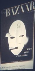
A. M. Cassandre |
1920s-30s - French designer - Pictorial Modernism - poster designer that used simple forms to create eye catching graphics - commercial use - make graphics better than photography |
|
|
Cassandre (Pictorial Modernism) - train track poster for Pullman Railways - context: classy way to travel - geometric but still representational - great composition for commercial work |
|
|
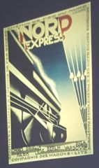
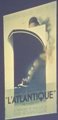
Cassandre (Pictorial Modernism) - Nord Express Poster - geometric train - cubism inspired |
|
|
Stenberg Brothers |
1929 Pictorial Modernism - inspired by beggarstaff brothers: flat colors - posters for movies - very representational |
|
|
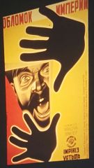
Stenberg Brothers Pictorial Modernism - Film Poster - average man looking towards future (technology) - graphic |
|
|
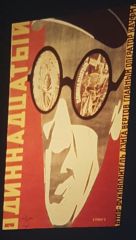
Stenberg Brothers Pictorial Modernism - Film Poster (Russian Revolution) - tzar trying to stop working class |
|
|
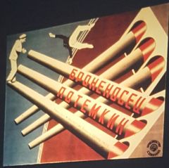
Stenberg Brothers Pictorial Modernism - Battleship Potempkin Poster - representational |
|
|
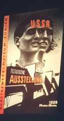
El Lissitzky 1929 - Russian exhibition poster - photo experimentation |
|
|
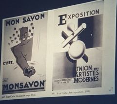
Jean Carlu (Pictorial Modernism)
- 1925,1931: 2 posters - 1st: pictorial modernism - 2nd: abstract modernism |
|
|
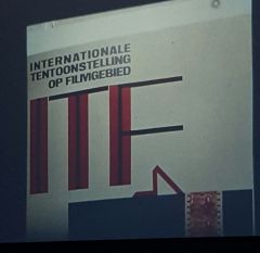
Piet Zwart (Avant Garde Photo Work) - 1929: Zwart: international film festival - informational: diagram of watching movie |
|
|
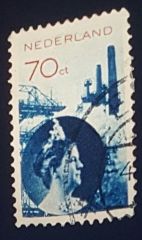
Piet Zwart (Photo Integration) - 1930: 1st photographic stamp - example of government accepting new design - visual truth: picture of queen instead of idealistic art |
|
|
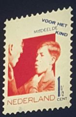
Paul Schuitema (Photo use) - 1930: photographic stamp for kid charity(Dutch) - big deal: modernism is spreading to gov. standards |
|
|
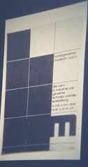
Swiss Designers |
1920s - known for extreme grids, modularity - developed into international style - proponents: Theo Ballmer, Herbert Matter, Max Bill |
|
|
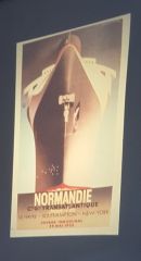
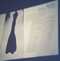
Pictorial Modernism Cassandre - 1935: cruise liner poster - strong scale, symmetry |
|
|
Pictorial Modernism Cassandre - 1935: cruise liner poster scale |
|
|
Pictorial Modernism Cassandre - 1935ish |
|
|
Theo Ballmer |
Swiss Design 1920s - 1920: went to Bauhaus - 1922: goes back to Switzerland (inspired by Bauhaus and De Stijl) - strong grid systems - made curriculum for Gestaltung Basel (GD college of Swiss) |
|
- |
Swiss Design 1920s Theo Ballmer - strong grid system |
|
|
Swiss Design 1920s Theo Ballmer - strong grid system - de stijl typeface |
|
|
Herbert Matter |
Swiss Design 1920s - pictorial modernism - inspired by french painting - commercial design: tourism, department store, sak plakat object poster evolution |
|
|
Swiss Design 1920s Herbert Matter - department store poster - pictorial modernism: machineish man |
|
|
Swiss Design 1920s Herbert Matter - photography tourism poster, visual truth - copied by Paula scher |
|
|
Swiss Design 1920s Herbert Matter - sak plakat evolution poster (visual truth) |
|
|
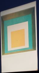
Max Bill |
Swiss Design 1920s - very minimal design, grid design, international style, visual science - strong grid |
|
|
Swiss Design 1920s Max Bill - step 1: kind of ornamental - inspired by: Futurism Dada |
|
|
Swiss Design 1920s Max Bill - step 2: no more ornament, more geometric |
|
|
Swiss Design 1920s Max Bill - 1940: for Christmas gift shop - strong underlying grid structure and pattern |
|
|
Swiss Design 1920s Max Bill - title page: multiple languages (International Style) |
|
|
Swiss Design 1920s Max Bill - strong underlying grid: minimal text |
|
|
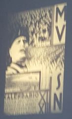
F. T. Marinetti - late 1930s: Mussolini poster |
|
|
Modernism in America |
1920s-40s
- Edward McKnight Kauffer - Josef Binder - Alexei Brodovitch |
|
|
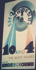
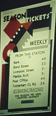
Edward McKnight Kauffer |
Modernism America 1920s-40s - goes to Chicago, studies GD with Goudy - goes to Europe: sees modernism - works for london undergound: posters - ART DECO style: streamlined style (trains) - exposition des arts decoratifs - futurism inspired - strongly geometric - contradicted A and C England Design |
|
|
Modernism comes to America 1920s-40s Edward McKnight - for London Underground - Art Deco example: streamlined - strong concept |
|
|
Modernism in America 1920s-40s Edward McKnight -for London Underground |
|
|
Modernism in America 1920s-40sEdward McKnight |
|
|
Futura Type Specimen - Paul Renner: 1928-31 - practical minimalism (inspired by Bayer's Universal) |
|
|
Modern Swiss Poster |
|
|
Josef Binder |
Modernism in America 1920s-40s
- technological showcase, pictorial modernism |
|
|
Modernism in America 1920s-40s Josef Binder 1939: Technological showcase |
|
|
Modernism in America 1920s-40s Josef Binder - grocery store poster - pictorial modernism |
|
|
Alexei Brodovitch |
Modernism in America 1920s-40s - Russian late 1930s - 1917: saw russian constructivist work - moves to paris: modern art - futurists, Mondrian, Picasso - goes to NY: brings new modern art/design - art director for Conde Nast (magazine publisher) - hires a lot of fleeing designers from europe - reworked past designer's work |
|
|
Modernism in America 1920s-40s Alexei Brodovitch - magazine cover: african picasso inspiration |
|
|
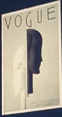
Modernism in America 1920s-40s Alexei Brodovitch - 1930s: vogue magazine |
|
|
Modernism in America 1920s-40s Alexei Brodovitch - vogue layout |
|
|
Modernism in America 1920s-40s Alexei Brodovitch - Rodchenko inspired advertisement |
|
|
Modernism in America 1920s-40s Alexei Brodovitch - inspired by Cassandre (boat) |
|
|
Modernism in America 1920s-40s Alexei Brodovitch - 1942: Salvador Dali inspired graphic |
|
|
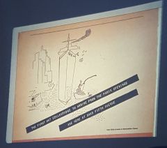
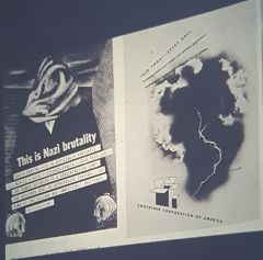
- Container Corporation of America - centered in Chicago in 1930s - head: Walter Papke (wife: elizabeth) - hired european designers to make magazine ads: Cassandre, Bernhard |
|
|
- Container Corporation of America - hoover dam magazine cover |
|
|
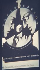
Container Corporation of America - Cassandre design |
|
|
Container Corporation of America - Cassandre design |
|
|
Container Corporation of America - Lucien Bernhard |
|
|
Magazines |
mid 1900s air mail allowed publication everywhere across US at same time - instant influence - design choices had to be made - European modern designers were going to USA (fleeing from hitler) |
|
|
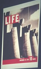
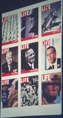
Magazines mid 1900s - life magazine design |
|
|
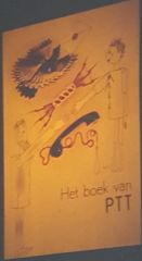
Information Design - 1938: Piet Zwart: asked by Dutch Gov to make book for PTT - for school age children: understand phones, post office |
|
|
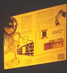
Information Design - 1938: inside Piet Zwart Children Book - clear information design: size references |
|
|
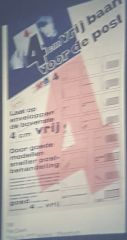
Information Design - Piet Zwart Book for Adults - catered to audience |
|
|
1933-1939 |
- Bauhaus proponents spread out: England, Switzerland, US - Roosevelt - New Deal - Technology: dishwasher, television, appliances |
|
|
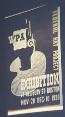
1933-39 - WPA poster: art for postal offices |
|
|
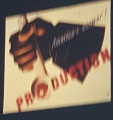
- Jean Carlu: 1940: response to make supplies for war (money)
- pictorial modernism |
|

|
- Herbert Bayer Poster
- abstract modernism, scale |
|

|
- Herbert Matter - CCA
|
|
|
- Ben Shawn- CCA
- allowed crazy ads for social rights |
|
|
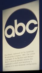
Paul Rand |
Modernism in America Branding/Commercial Design 1930s-40s - american designer - copied a lot from history - commercial artist (used term graphic designer): abc logo, IBM - him and Bradbury convinced Yale to become Graphic Design faculty |
|
|
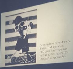
Paul Rand 1938: Apparel Arts |
|
|
Paul Rand - 1940: christmas edition - WW2 context |
|
|
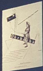
Paul Rand - Ohrbach’s inspired: Brodevitch |
|
|
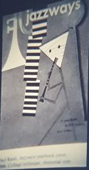
Paul Rand - cover for Jazz Ways Magazine - paul clay inspired |
|
|
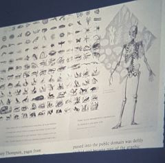
Bradbury Thompson |
1930s - American Designer - “inspirations for printers”: magazine of printing techniques - worked for WESTVACO - made whatever he wanted for magazine - He and Paul Rand convinced Yale to become Graphic Design faculty |
|
|
Bradbury Thompson - for WESTVACO: whatever he wanted |
|
|
Bradbury Thompson - type experimentation: monocase |
|
|
Bradbury Thompson - type experimentation: monocase |
|
|
Bradbury Thompson - overlapping of color |
|
|
Alvin Lustig |
American Designer (LA) - first well-rounded West Coast American designer - Art Deco: unlikely print materials |
|
|
- Ghost of the Under blows: Lustig
- unlikely print materials (art deco) |
|
|
brochure for GI, 1945: Lustig
|
|
|
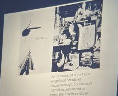
- Portfolio magazine (directed by Brodevitch)
- crazy elaborate production |
|
|
CP Pineles |
1950s - one of the 1st woman graphic designer - art director under Brodevitch in NY - clever optical illusions |
|
|
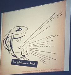
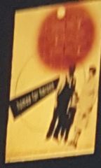
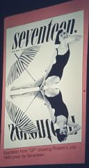
Pineles, 1949: Seventeen Magazine cover - clever optical illusion |
|
|
Modernism in America |
1930s - playful take on modernism - broke grid, but still had lots of geometric shapes - Paul Rand, W.A. Dwiggens, Bradbury Thompson, Alvin Lustig, CP Pineles |
|
|
W.A. Dwiggens |
Modernism in America Boston, USA - 1929: wrote book: Layout in Advertising (commercial art guide) - coined term "graphic design" |
|
|
Herbert Matter Branding Design - Logo for NH Railways |
|
|
Commercial Design - Paul Rand: ABC logo - based off of bauhaus typeface |
|
|
After World War II |
1945-60 - Era of rational technology/science - space race: soviet vs usa - Bauhaus idea of visual science - tied into corporate identity work - business is booming in US |
|
|
Corporate Identity |
America 1950s-60s - branding: standardized layout/typeface - graphic design become legitimate profession - visual rationalism - television influence - Paul Rand, Saul Bass, C and G - American designers were now making design for Europeans |
|
|
Corporate Identity 1950s-60s 1960: Paul Rand: Westinghouse logo - showed progress: motion graphics logo - television adaptation |
|
|
Saul Bass |
Corporate Identity (1950s-60s) USA designer - originally: cut paper modernism - later: corporate identity work (logos) |
|
|
Corporate Identity 1950s-60s - 1958: Saul Bass movie poster - fun with swiss grid - cut paper modernism |
|
|
Corporate Identity 1950s-60s - 1958ish: Saul Bass - cut paper style |
|
|
Corporate Identity 1950s-60s - Saul Bass logo designs |
|
|
Corporate Identity 1950s-60s - 1957: CIBA Geigy (pharmaceutical company) - embrace idea of visual science/corporate identity - standardized branding |
|
|
Chermeyeff, Geismar, and Brown John |
Corporate Identity 1950s-60s NY, USA - one of the first corporate identity proponents - worked for CIBA - Americans were now making designs for Europeans |
|
|
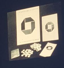
Corporate Identity 1950s-60s - 1960s: Chermeyeff and Geismar logo for Chase Bank |
|
|
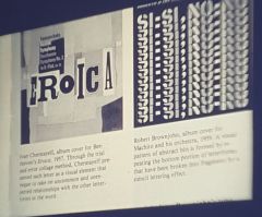
Chermeyeff and Geismar - 1957-59, Album covers - completely expressive, unlike corporate identity design |
|
|
Emil Ruder |
- involved in New Graphic Design Magazine (Neue Grafik) - completely wiped away modern americanism (No more playfulness) - voice for German Designers: ULM Gestaltung, Diester Rams, Johnny Ive |
|

|
Emil Ruder - magazine cover for Neue Grafik - very de stijl influenced (3 languages) |
|
|
Counter Culture |
1960s - against main stream culture - rock and roll - Elvis Presley: spread to Europe (Beatles, Rolling Stones) - Korean War, Vietnam War: public realizes science is killing people (result: the military industrial complex) - inspires pop art: reevaluating the everyday - Hippy movement: Bob Dylan (Milton Glaser poster) - crazy solarized colors - Civil Rights Movement |
|
|
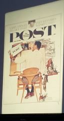
Counter Culture 1960s - 1961: Norman Rockwell Saturday evening post |
|
|
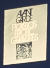
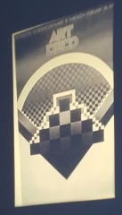
Counter Culture 1960s - Avant Garde Magazine |
|
|
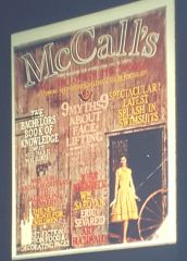
Counter Culture 1960s - 1961: McCall's Magazine - dress good for barn too |
|
|
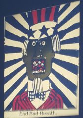
Counter Culture 1960s - political statement: against war and government lies |
|
|
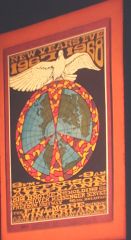
Counter Culture 1960s - 1967: hippy poster (A and C idea of rejecting current culture) |
|
|
Victor Moscoso |
Counter Culture 1960s - hippy poster designer - went to Yale with Albers - spent rest of career contradicting teaching |
|
|
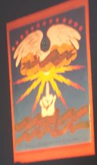
Counter Culture 1960s - Victor Moscoso: poster design |
|
|
Counter Culture 1960s Pop Art - Jasper Johns: pop art: no more visual science - observing the everyday |
|
|
Counter Culture 1960s Pop Art - Roy L. : pop art comic book design |
|
|
Counter Culture 1960s Josef Albers: square series |
|
|
Counter Culture 1960s Pop Art - Marilyn Monroe Magazine |
|
|
Counter Culture 1960s - Massin (French Typographer) - expressive typography - book: Bald Soprano |
|
|
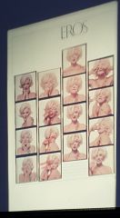
Counter Culture 1960s - Civil Rights Movement: Eros Magazine |
|
|
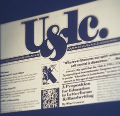
Counter Culture 1960s - Herb Lubalin: designer/editor for Uppercase and lowercase (typographic newsletter) - lettering master |
|
|
Counter Culture 1960s - Herb Lubalin: design for Upper and lowercase |
|
|
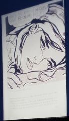
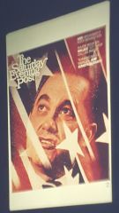
Counter Culture 1960s 1968: Saturday evening post of George Wallace - radical change from hand illustration to photography - impeccable dark room skills |
|
|
1970s |
Interest in Design History - Milton Glaser |
|

|
Counter Culture 1960s Interest in Design History - Milton Glaser 1970s: interest in Dada and Surrealism - more toned down |
|
|
Counter Culture 1960s Interest in Design History - 1977: show on Art Deco |
|
|
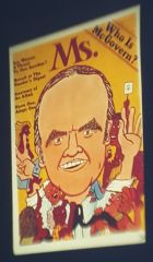
Counter Culture 1960s - Feminist movement - Ms Magazine of McGovern (magazine for women) |
|
|
Wolfgang Weingart |
1970s Swiss Designer - typography instructor at Gestaltung Basel - liked counter culture - made own visual effects with negatives - brought new swiss typography: Punk Swiss - expressive/experimental type |
|
|
Punk Swiss 1970s - Weingart: expressive typography |
|
|
Punk Swiss 1970s - Weingart: expressive typography |
|
|
Punk Swiss 1970s - 1983 Weingart: for Swiss show |
|
|
1980s America |
- Graphic Design is respected profession - very conservative ideas |
|
|
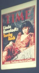
1980s Conservatism - Weingart: America, 1980: Time Magazine - flagged as inappropriate: replaced with new coverSlide 33: |
|
|
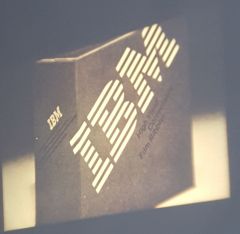
1980s Corporate Identity - 1980: Paul Rand: IBM logo |
|
|
1980s America - Josef Brockman: geometric structure of page(grid)- swiss design ideas |
|
|
Post-Modernism
|
1971: Learning from Las Vegas: book about signs - something beyond modernism: experimental design based on modernism - 1980s graphics: POMO - punk swiss influence - Cranbrook Academy of Art (Detroit) - Cal Arts - Emigre Magazine - culture is demanding faster technology - leads to digital art |
|
|
Post Modernism 1970s - Cranbrook Academy of Art design |
|
|
April Greiman |
Post Modernism 1980s (woman) - student of Weingart - USA, LA, 1980s - interpretation of modernism: geometric shapes without a grid - more fun - Some of the first digital design |
|

|
Post Modernism 1980s - Greiman |
|
|
Post Modernism 1980s - Greiman |
|
|
Post Modernism 1980s - Greiman: fun structure |
|
|
Post Modernism 1980s - 1988: Greiman: for Museum of Modern Art - made on Macintosh (1984 release) |
|
|
Post Modernism 1980s |
|
|
1980s Visual Thinking |
USA Today: visual infographics |
|
|
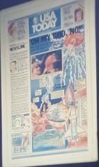
1980s Visual Thinking - USA Today : visual infographic on shuttle fail - new design thinking: visualize story |
|
|
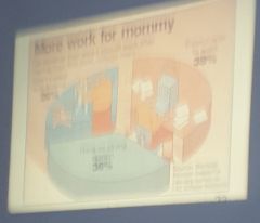
1980s Visual Thinking
- infographic chart - new design thinking: visualize story |
|
|
Digital Design |
- because of 1984 release of Macintosh Computer - April Greiman, Randy Vanderlans - and so on |
|
|
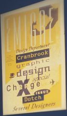
Rudy Vanderlans |
Post Modernism Digital Design 1980s - (Dutch designer in America) - made Emigre Magazine: became super popular - digital design - font design |
|
|
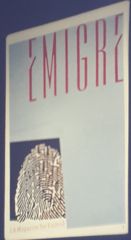
Post Modernism 1980s Rudy Vanderlans - Emigre cover - not digital |
|
|
Post Modernism Digital Design 1980s Rudy Vanderlans - made with Macintosh - layers, cutting edge design |
|
|
Post Modernism Digital Design 1980s Rudy Vanderlans - font design: inspired by de Stijl |
|
|
Post Modernism Digital Design 1980s Rudy Vanderlans |
|
|
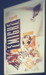
Post Modernism Digital Design 1980s Rudy Vanderlans - Emigre cover: digital design |
|
|
1980s Post Modernism -non normal edge |
|
|
Robert Nakata |
1980s post modernism - de stijl influence |
|
|
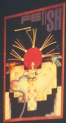
David Carson |
Post Modernism 1980s - ray gun design - nike ads |
|
|
Post Modernism 1980s |